The Style section in Admin Portal > Management lets you create and manage reusable styles for the Mosaic-hosted SSO experience. From here, you can configure elements such as fonts, logos, colors, card layout, and input field appearance so that the hosted SSO experience reflects your brand identity.
This styling applies to supported screens in the Mosaic-hosted SSO experience, such as:
- Login screens where users select one or more authentication methods.
- OTP verification screens
- Passkey screens
- Collect Information screens: journey steps that collect information from the user.
- Success or completion screens: screens shown when the flow is successfully completed.
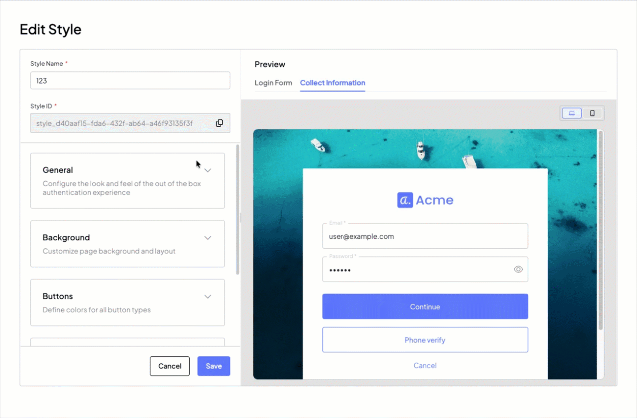
The Add Styles page is divided into two main sections: the configuration panel, which includes style identification fields and expandable setting groups, and a real-time preview, which shows how the Mosaic-hosted SSO experience will appear with desktop and mobile view toggles.
At the top of the page, before the settings groups, there are two identification fields:
- Style Name: the name used to identify the style within the portal.
- Style ID: the automatically generated unique identifier of the style, which can be used for API references.
To apply a style to SSO UIs, it is mandatory to associate the style with the relevant SSO client. This association is what makes the style available for that client in the SSO flow at runtime.
- Create the style in the Admin Portal > Style section and save it.
- In the Style page, locate the relevant style card, click the vertical three-dot menu, and select Assign clients.
- In the popup, review the list of existing SSO clients and assign the style to the relevant ones.
For more information about how SSO clients are configured and grouped, see Configure SSO Service.
In SSO journeys, you can preview and use a style in the form builder for supported client-facing steps that render the Mosaic-hosted SSO experience. Currently, this applies to the Login Form step and the Collect Information step.
The style dropdown is available only in SSO journeys, and a style appears there only if it has already been associated with the relevant SSO client.
To use a style in one of these steps:
- Create the style in the Admin Portal > Style section and save it.
- If you are working with an SSO journey, assign the style to the relevant SSO client first.
- Create or open the relevant journey.
- Add a Login Form step or a Collect Information step.
- In the step configuration, open Views & Actions.
- In the top-right corner of the editor, select the style you want to preview on the step.
- Save the step configuration.
In addition to previewing a style, Views & Actions lets you customize the content of the displayed form, including its text, fields, and field behavior. For more information, see Build forms with the form builder
When a style is deleted or a client is unassociated from its style, the affected client automatically falls back to the default rendering. This means hosted pages will never break due to a missing style, but the visual appearance will change immediately and without warning to end users. The default Mosaic style cannot be deleted.
Configures the overall look and feel of the standard authentication experience.
| Setting | Description |
|---|---|
| Logo | Uploads the brand logo displayed on the pages. Recommended: PNG or SVG with transparent background. Max: 50KB. |
| Logo placement | Determines where the logo is positioned on the page, for example in the header, footer, card top, or card bottom. |
| Logo alignment | Defines the horizontal alignment of the logo, for example left, center, or right. |
| Default language | Sets the default language used for the authentication page text. If a browser does not specify a language or requests an unsupported language, the default language is shown. |
| Supported languages | Lists the languages supported by the style. A language is supported when specified either in the request parameter or in the browser header. |
| Font family | Defines the font family used for all text across the authentication pages. |
| Text color | Sets the primary text color used for body text and labels throughout the pages, in RGB or HEX. |
| Mosaic logo | The Display Mosaic logo toggle enables or disables the Mosaic logo at the bottom of the card. |
| Privacy notice | The Enable Privacy Notice toggle enables or disables a privacy notice on the authentication pages. When enabled, it displays: How we use cookies - This website only uses strictly necessary cookies that are essential for core functions like security, network management, and accessibility. We do not use any tracking or advertising cookies. |
Customizes the page background and layout.
| Setting | Description |
|---|---|
| Background Color | Sets the page background color in RGB or HEX. |
| Background Image | Uploads a background image that overrides the page background color. |
| Page Background | Controls how and where the page background is anchored, for example top, center, or bottom. |
Defines the colors for all button types used across the pages.
| Setting | Description |
|---|---|
| Primary button background color | Sets the background color of primary buttons, such as main actions like Continue, in RGB or HEX. |
| Primary button text color | Sets the text color of primary buttons in RGB or HEX. |
| Secondary button background color | Sets the background color of secondary buttons, which are typically used for alternative actions and can also be transparent, in RGB or HEX. |
| Secondary button text color | Sets the text color of secondary buttons in RGB or HEX. |
| Secondary button border color | Sets the border color of secondary buttons in RGB or HEX. |
| Tertiary button color | Sets the color of tertiary buttons, which are lower-emphasis and typically link-like, in RGB or HEX. |
| Buttons border radius | Sets the corner radius applied to all buttons through a slider and numeric input in pixels. |
Customizes the style and alignment of the card, which is the main container that holds authentication forms and content.
| Setting | Description |
|---|---|
| Card position | Sets the position of the card within the page, for example left, center, or right. |
| Card content alignment | Sets the alignment of the content inside the card, for example left, center, or right. |
| Card width | Sets the card width in pixels through a slider and numeric input. It is applied as a max width and collapses to full width on mobile. |
| Card background color | Sets the background color of the card in RGB or HEX. |
| Card border radius | Sets the corner radius of the card through a slider and numeric input in pixels. |
Customizes the appearance of input fields and their labels (for example, username and password fields).
| Setting | Description |
|---|---|
| Input field background color | Sets the background color of input fields in RGB or HEX. |
| Input field label color | Sets the color of labels associated with input fields in RGB or HEX. |
| Input field text color | Sets the color of the text entered by the user in input fields in RGB or HEX. |
| Input field border radius | Sets the corner radius of input fields through a slider and numeric input in pixels. |